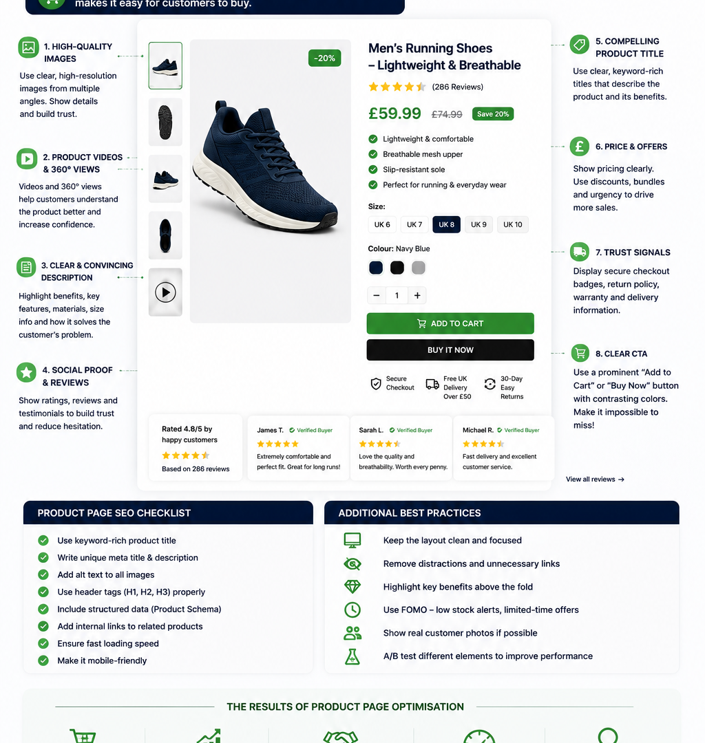
Most product pages lose sales in the same handful of places: a blurry hero image, a description that reads like a spec sheet, no reviews above the fold, and a page that takes four seconds too long to load. None of these are exotic problems. They’re fixable in an afternoon, and fixing them is usually the highest-leverage work you can do on an ecommerce site, because product pages are where browsing turns into buying or doesn’t.
This guide walks through product page optimization as a system: the 10 elements every high-converting page shares, a quick anatomy of how they fit together, and a practical walkthrough of the one technical piece most store owners skip product schema markup.
Think of the annotated graphic above as your checklist made visual: hero image and zoom in the top-left, price and urgency messaging near the buy box, reviews and trust badges just below the fold, and cross-sells further down the page. Every element below maps to a labelled zone on that anatomy.
1. Hero Images and Zoom Functionality
Product photography is the first thing a visitor evaluates, often before they read a single word of copy. High-resolution hero images, multiple angles, and a working image zoom feature let shoppers do the closest thing to picking up the product in a store.
Quick wins:
- Shoot (or source) at least 46 images per product: front, back, detail, in-use, and scale reference.
- Enable hover-to-zoom or click-to-zoom rather than a static image shoppers use zoom to check texture, stitching, material, and fine print before buying.
- Keep a consistent background and lighting style across the catalogue so the store feels curated rather than assembled from different sources.
If budget is tight, prioritise zoom on your highest-margin or highest-return-rate products first these are where visual clarity has the most direct effect on both conversion and returns.
2. Product Descriptions That Sell
A description that lists dimensions and materials is doing half the job. The other half is answering the question every shopper is silently asking: what does this do for me?
The best product descriptions:
- Lead with the outcome or benefit, then support it with features and specs.
- Use scannable formatting short paragraphs, bullet points for specs, bold for key details because most shoppers skim before they read.
- Match the tone to the buyer, not the brand’s internal voice. A technical buyer wants precision; a gift buyer wants reassurance and occasion-based language.
Before/after example from a recent project: Before: “Ceramic mug. 350ml capacity. Dishwasher safe. Available in 4 colours.” After: “Start the morning right with a mug that actually holds enough coffee 350ml, double the size of a standard cup. Glazed stoneware keeps drinks hot longer and stands up to the dishwasher, so it’s built for daily use, not just the shelf. Pick from 4 colours to match your kitchen or grab one for the person who always steals yours.”
The rewrite didn’t add new claims, it reordered the same facts around a benefit, added a sensory detail (holds heat), and gave the shopper a reason to buy today rather than “someday.” That kind of rewrite, applied consistently across a catalogue, is usually where the biggest conversion lift comes from with the least development effort.
3. Reviews and Social Proof
Reviews are one of the few page elements that build trust without you having to say anything at all. Shoppers consistently rate reviews as one of the most important factors in a purchase decision, particularly for products they haven’t handled in person.
To get the most from reviews:
- Show a star rating and review count near the product title, not buried below the fold.
- Surface photo and video reviews above text-only ones user-generated images do more to reduce purchase hesitation than another paragraph of praise.
- Respond to negative reviews visibly. A hIf you’re a new store with few reviews, consider a review-request email flow post-purchase this is often the single fastest way to build a review base organically.
4. Size Guides and Fit Information
A good size guide removes the guesswork before the sale, not after.
- Include a size chart with actual measurements (not just S/M/L), and ideally a “how to measure” mini-guide.
- If you have return data, surface fit feedback “runs small,” “true to size” pulled from customer reviews or a simple fit-rating widget.
- Link the size guide directly next to the size selector, not in a separate help page three clicks away.
5. Schema Markup for Rich Results
Product schema markup is structured data that tells search engines exactly what your product page contains price, availability, rating, brand so Google can display it as a rich result with stars, price, and stock status directly in the search listing. Pages with correctly implemented schema tend to stand out more in search results and can improve click-through rate, even without a change in ranking position.
We’ve dedicated a full walkthrough to this below, since it’s the one item on this list most store owners skip entirely usually not because it’s hard, but because it’s invisible on the page itself.
6. Page Speed
Every extra second of load time is an opportunity for a shopper to bounce, particularly on mobile. Product pages are often the heaviest pages on a site
multiple high-resolution images, embedded video, review widgets, and third-party scripts for personalisation or chat all add up.
Quick wins:
- Compress and lazy-load product images so only what’s visible loads first.
- Serve images in modern formats (WebP/AVIF) with responsive sizing for mobile.
- Audit third-party scripts (reviews, chat, personalisation, analytics) each one adds render-blocking weight, and it’s common to find two or three doing overlapping jobs.
- Test with a real device on a throttled connection, not just desktop Wi-Fi mobile performance is usually where the gap is widest.
7. Urgency and Scarcity Cues
Used honestly, urgency messaging nudges an undecided shopper toward a decision rather than a “maybe later” that never comes back. Used dishonestly (fake countdown timers, “3 left in stock” that never changes), it erodes trust fast shoppers notice.
Effective, honest urgency:
- Real stock-level indicators when inventory is genuinely limited.
8. Cross-Sells and Upsells
The product page is prime real estate for increasing average order value, but only if the recommendations are genuinely relevant. “Frequently bought together,” “complete the look,” or “you may also need” sections work because they solve a problem the shopper hasn’t thought of yet a phone case buyer who hasn’t considered a screen protector, for instance.
- Keep cross-sells below the main buy box and description, not competing with the primary CTA.
- Base recommendations on actual co-purchase data where possible, not just “same category.”
- Limit to 34 items too many options can slow the decision rather than support it.
9. Trust Signals and Guarantees
Security badges, clear return policies, and shipping information reduce the perceived risk of buying from a store the shopper may not know well. These work best placed near the buy button, where hesitation peaks.
- State the return window in plain terms directly on the product page (“Free returns within 30 days”), not just in a policy page link.
- Show payment method icons and any security badges near checkout-adjacent elements.
- If you offer a guarantee, name it specifically “Lifetime warranty on stitching” builds more confidence than a generic trust badge.
10. Clear Pricing and a Single Obvious CTA
It sounds basic, but pages with multiple competing calls to action (“Add to Cart,” “Save for Later,” “Compare,” “Ask a Question” all styled the same) genuinely convert worse than pages with one dominant CTA and secondary actions visually subordinate to it.
- Make “Add to Cart” or “Buy Now” the clear visual priority colour, size, and placement should all reinforce it.
- Show the final price clearly, including any discount logic, without requiring the shopper to reach the checkout to see the real number.
- If shipping costs affect the decision, surface an estimate on the product page rather than saving it as a checkout surprise.
How to Add Product Schema Markup: A Quick Walkthrough
Product schema doesn’t change how your page looks to a visitor, it changes what search engines understand about it. Here’s the practical version:
- Choose your format. JSOLD is the format Google recommends, and it sits in a <script> tag without touching your visible HTML.
- Include the core fields: name, image, description, sku, brand, offers (with price, priceCurrency, and availability), and aggregateRating (with ratingValue and reviewCount) if you have reviews.
- Keep it accurate and current. Schema price and availability must match what’s actually on the page; mismatches can lead to rich results being suppressed.
- Automate it where possible. Most major ecommerce platforms (Shopify, WooCommerce, BigCommerce) offer apps or themes that generate this automatically; for custom builds, it can be templated once per product type and populated from your existing product data.
- Validate before publishing. Use a structured data testing tool to confirm the markup is read correctly and there are no missing required fields.
- Monitor in Search Console. The “Merchant listings” or “Products” report will flag errors or warnings once Google starts crawling the updated pages.
This is a one-time technical setup per product template, not a per-product manual task which is exactly why it’s worth doing properly once rather than skipping it indefinitely.
FAQs
How long should product descriptions be? There’s no fixed word count that works for every product. A $15 phone case needs less than a $1,500 sofa. As a working guide, aim for enough copy to answer the shopper’s real questions (what it does, who it’s for, what makes it different) without padding. Short, benefit-led copy with scannable bullets usually outperforms long blocks of unbroken text, even when the total word count is similar.
Do reviews really matter for conversion? Yes reviews are consistently one of the strongest trust signals on a product page, especially for shoppers who haven’t interacted with the physical product. A visible rating, a healthy review count, and a few detailed or photo reviews typically do more for conversion than any other single trust element on the page.
What is product schema markup, in plain terms? It’s a small block of structured data added to your page’s code that tells search engines specific facts about the product price, stock status, rating in a format they can read directly
Fixing product pages one element at a time works, but it’s slow if you’re doing it across a full catalogue. If your team needs product descriptions rewritten at scale, review strategy built out, or schema implemented site-wide, our content writing service and ecommerce services teams handle exactly this from copy that’s built to convert to the technical setup that gets your listings noticed in search.
Leave a Reply