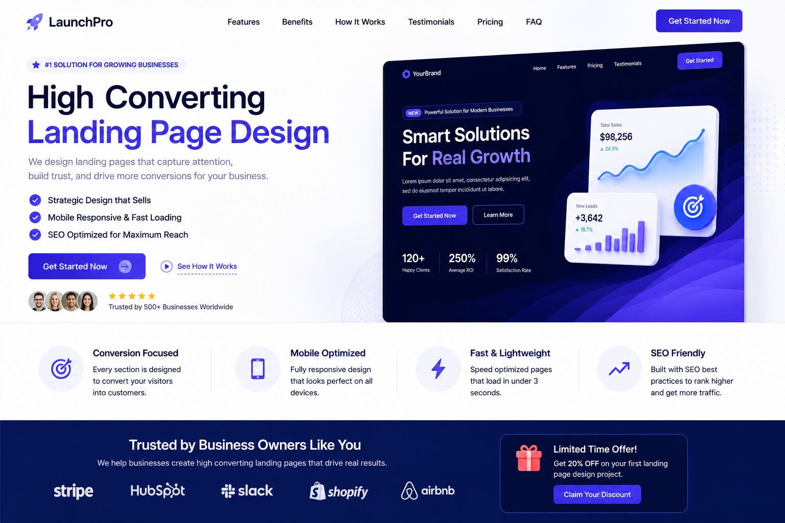
Most service-business landing pages lose visitors in the first five seconds not because the offer is bad, but because the page makes people work too hard to understand it. The businesses that consistently turn traffic into quote requests aren’t relying on luck or a clever headline. They’re applying a small, repeatable set of design and copy decisions, then checking the data to confirm those decisions are working.
What Conversion Rate Should You Actually Expect?
Before diving into the elements, it helps to have a benchmark. Across service industries home services, B2B consulting, agencies, local trades a landing page built for a paid or organic campaign typically converts somewhere between 2% and 5% of visitors into a lead (a form fill, call, or quote request). Pages above 5% are usually doing several of the following nine things well at once.
If your own quote or contact page hasn’t been benchmarked yet, that’s the first thing to fix before changing anything else you can’t improve what you haven’t measured.
1. A Hero Section That Leads With the Offer, Not the Brand
The hero is the single highest-leverage piece of real estate on the page, and it’s the most commonly wasted. Many service pages open with the company name, a stock photo, and a vague tagline like “Your Trusted Partner.” None of that tells a visitor what they get, for whom, or why it matters right now.
High-converting heroes instead answer three questions in under two seconds:
- What is this?
- Is it for me?
- What do I do next?
A hero headline like “Website Development for Service Businesses Live in 4 Weeks” does more conversion work than a paragraph of brand copy below it, because it removes ambiguity immediately.
2. Above-the-Fold Clarity, Tested for the 5-Second Rule
“Above the fold” still matters even though scrolling is second nature now, because it determines whether someone scrolls at all. The above-the-fold section should let a visitor state back, in their own words, what you do and who it’s for without scrolling.
A simple test: show the top of the page to someone unfamiliar with the business for five seconds, then ask them to describe it. If they can’t, the fold needs a rewrite before anything else on the page gets touched.
3. Social Proof Placed Where Doubt Actually Peaks
Social proof only works if it shows up at the moment a visitor is hesitating not just bundled into a testimonials section near the footer where few people scroll. The highest-converting pages place proof at three specific points:
- Right after the hero, as a trust signal (logos, review scores, a single strong stat)
- Beside the pricing or service breakdown, where price objections form
- Directly next to the form, as a final nudge before submission
A single specific testimonial (“Cut our page load time from 6s to 1.2s and quote requests doubled the next month”) consistently outperforms a wall of generic five-star quotes, because specificity reads as credible in a way vague praise doesn’t.
4. CTA Design and Placement That Repeats Without Repeating Itself
Calls to action fail in two opposite ways: there’s only one, buried at the bottom, or there are several, all saying the same generic “Submit.” Effective pages repeat the CTA at every natural pause point after the hero, after the proof section, after the service breakdown, and at the very end but vary the microcopy to match the context.
Instead of “Submit” everywhere, a page might use “Get My Free Quote” after pricing and “See If We’re a Fit” after a qualifying section. The action is the same; the framing matches what the visitor just read. Button color matters far less than contrast against the background and consistency in shape and placement, so people learn to recognize it as they scroll.
5. Reduced Form riction
Every additional form field is a small tax on conversion. Analyses of service-page forms consistently show a drop-off of several percentage points for each field added beyond the essentials name, email or phone, and a brief note on the need. Fields like “company size,” “how did you hear about us,” or a mandatory dropdown of twelve service options are usually there for the business’s convenience, not the visitor’s, and they cost conversions.
The fix isn’t always “delete fields” sometimes it’s splitting a long form into two short steps, since a two-step form often outperforms a single long one even with the same total fields, because the first step feels like a smaller commitment.
6. Page Speed as a Conversion Feature, Not Just an SEO Metric
Speed is frequently treated as a technical checkbox, but it behaves like a design element: it directly shapes how many people ever see the rest of the page. Every additional second of load time above roughly two to three seconds tends to compound bounce rate, meaning the best-designed hero section in the world does nothing if half the audience leaves before it renders.
Practical priorities, in order of impact: compress and lazy-load images below the fold, defer non-essential scripts, and avoid render-blocking fonts or third-party embeds in the hero itself.
7. Page Length Matched to Intent, Not a Fixed Rule
There’s no universal answer to “should my landing page be long or short” the right length depends on how much the visitor already knows and how big the decision is. A page for a low-commitment action (booking a free 15-minute call) can convert well at a few hundred words. A page for a higher-consideration service (a $15,000 website rebuild or a multi-month engagement) usually needs the length to build the case: process, proof, objection-handling, and pricing context.
The test isn’t word count it’s whether every section on the page is doing conversion work. A long page of padding underperforms a short page of substance, and a short page that skips necessary trust-building underperforms a longer one that earns it.
8. A/B Testing as an Ongoing Process, Not a One-Time Fix
The highest-performing pages aren’t guessed into existence they’re the result of testing one variable at a time against a clear goal, repeated over months. Common high-impact tests include headline framing, hero image versus no image, single-step versus two-step forms, and CTA copy.
The most common mistake is testing too many things simultaneously and testing for too short a period to reach a reliable sample size. A test run for three days on low traffic tells you almost nothing; the same test run for three to four weeks with enough conversions to be statistically meaningful tells you something you can act on.
9. Heatmaps and Session Recordings to Find the Real Problem
Analytics tell you that people are leaving; heatmaps and session recordings tell you why. A heatmap showing that visitors are hovering over a pricing section but not clicking through often means the pricing needs more context, not that pricing should be hidden. A recording showing people repeatedly trying to click a non-clickable image often means a design element is being mistaken for a button an easy, high-impact fix that no amount of copy testing would surface.
The teams that improve conversion fastest treat heatmaps as a monthly habit, not a one-time audit.
Teardown: A Real Landing Page, Annotated
Below is an annotated breakdown of a service landing page rebuild, showing where the original layout lost visitors and what changed in the redesign hero framing, proof placement, form length, and CTA repetition are marked directly on the page.
In this rebuild, moving proof directly beside the pricing section and cutting the form from seven fields to three were the two single biggest contributors to the lift in quote requests a pattern that shows up repeatedly across service-page redesigns.
FAQs
What’s a good conversion rate for a landing page? For most service businesses, 2–5% of visitors converting into a lead is a healthy range. Below 2% usually points to a clarity, trust, or friction problem; above 5% typically means several of the elements above are working together well. The right benchmark depends on traffic source too a page built for a branded search visitor will naturally convert higher than one built for cold paid traffic.
Should a landing page be long or short? Neither, by default match length to the size of the decision. Simple, low-cost actions convert well on short pages. Higher-consideration services usually need more length to build the case through proof, process, and objection-handling. The test is whether every section is earning its place, not the word count itself.
Do videos help conversion? Often, yes but only when they replace reading rather than adding to it.than paragraphs of text, especially for services where visitors are uncertain what they’re paying for A 30–60 second video that shows the process or introduces the team can build trust faster Videos that autoplay with sound, load slowly, or repeat information already on the page tend to hurt more than they help.
Get Your Landing Page Reviewed
If you’re not sure which of these nine elements is actually costing you conversions on your own page, a short audit will usually surface it faster than guessing. We offer a free conversion audit that reviews your hero, proof placement, form friction, and page speed against real visitor behavior request your audit here or see how we approach conversion-focused content for service pages.
Leave a Reply